
BREWSTER FEDERAL CREDIT UNION
ABOUT THIS PROJECT
As Brewster Federal Credit Union prepared for its next chapter, leadership sought to modernize the brand while preserving the trust and recognition they had built throughout the community for over 70 years. K4 Marketing + Branding partnered with the credit union to create a comprehensive brand refresh that honored its heritage while positioning the organization for future growth.
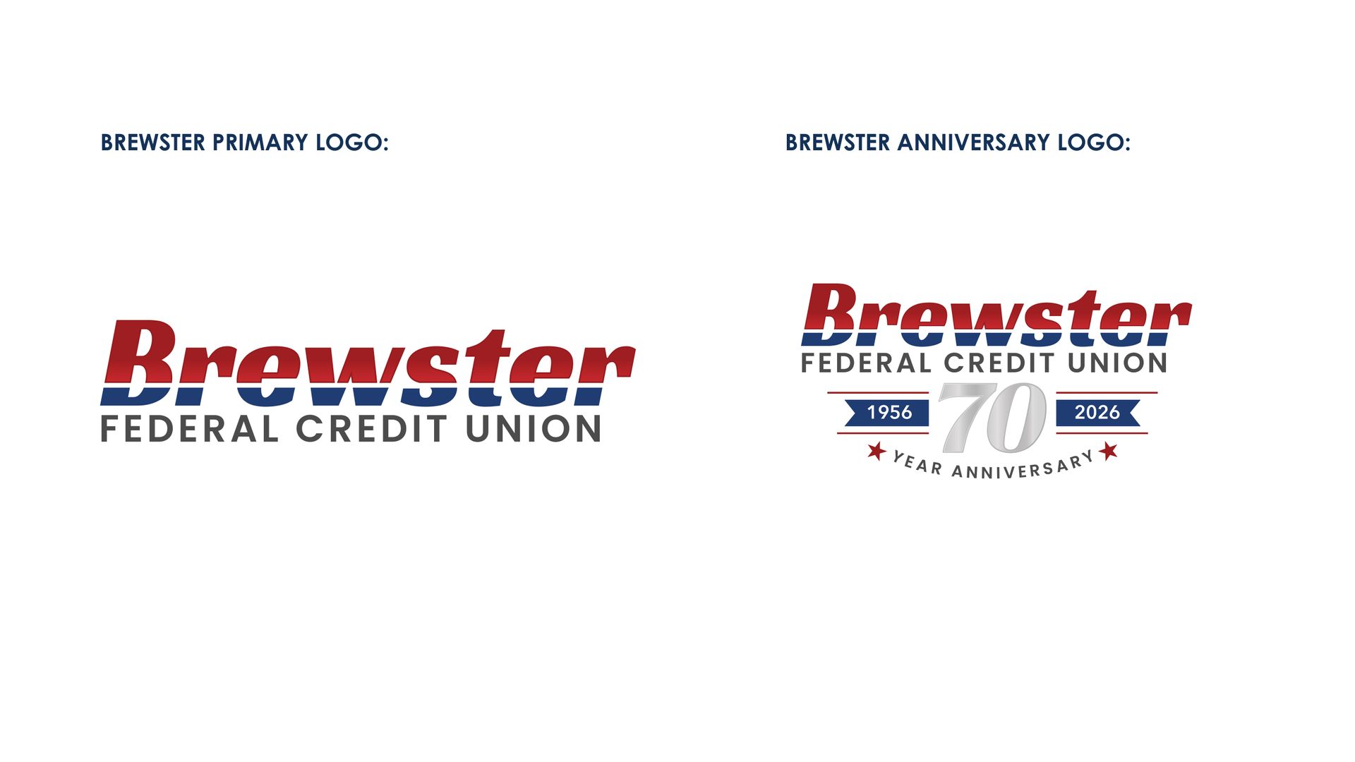
The project began with a strategic evaluation of Brewster's visual identity. K4 developed a refreshed logo that retained the familiar name that members had come to know while introducing cleaner typography and a refined color palette inspired by Brewster's heritage and local school colors. K4 also designed a custom 70th Anniversary logo to commemorate Brewster's milestone while complementing the refreshed brand.
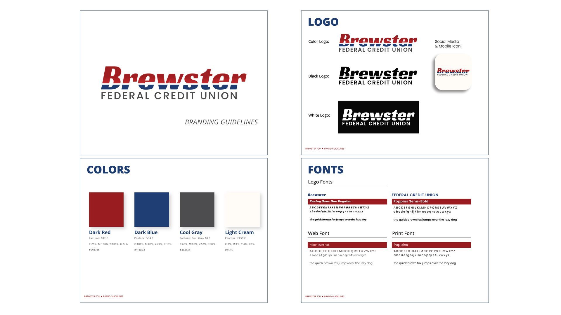
To ensure consistency across every member touchpoint, K4 developed a complete Brand Forward brand system. Comprehensive brand standards established clear guidelines for logo usage, typography and color palettes - giving staff and vendors the tools to represent the credit union consistently across all member touchpoints.
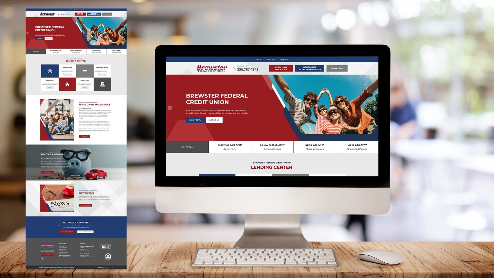
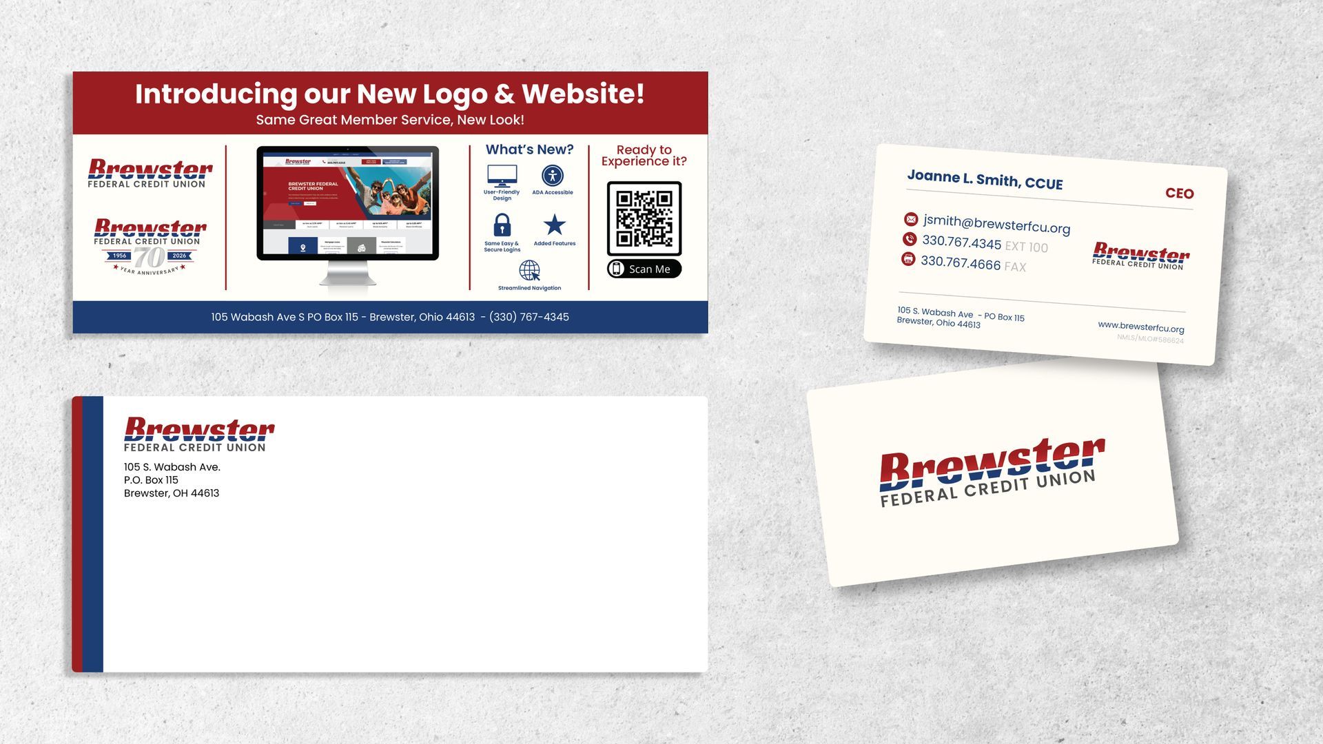
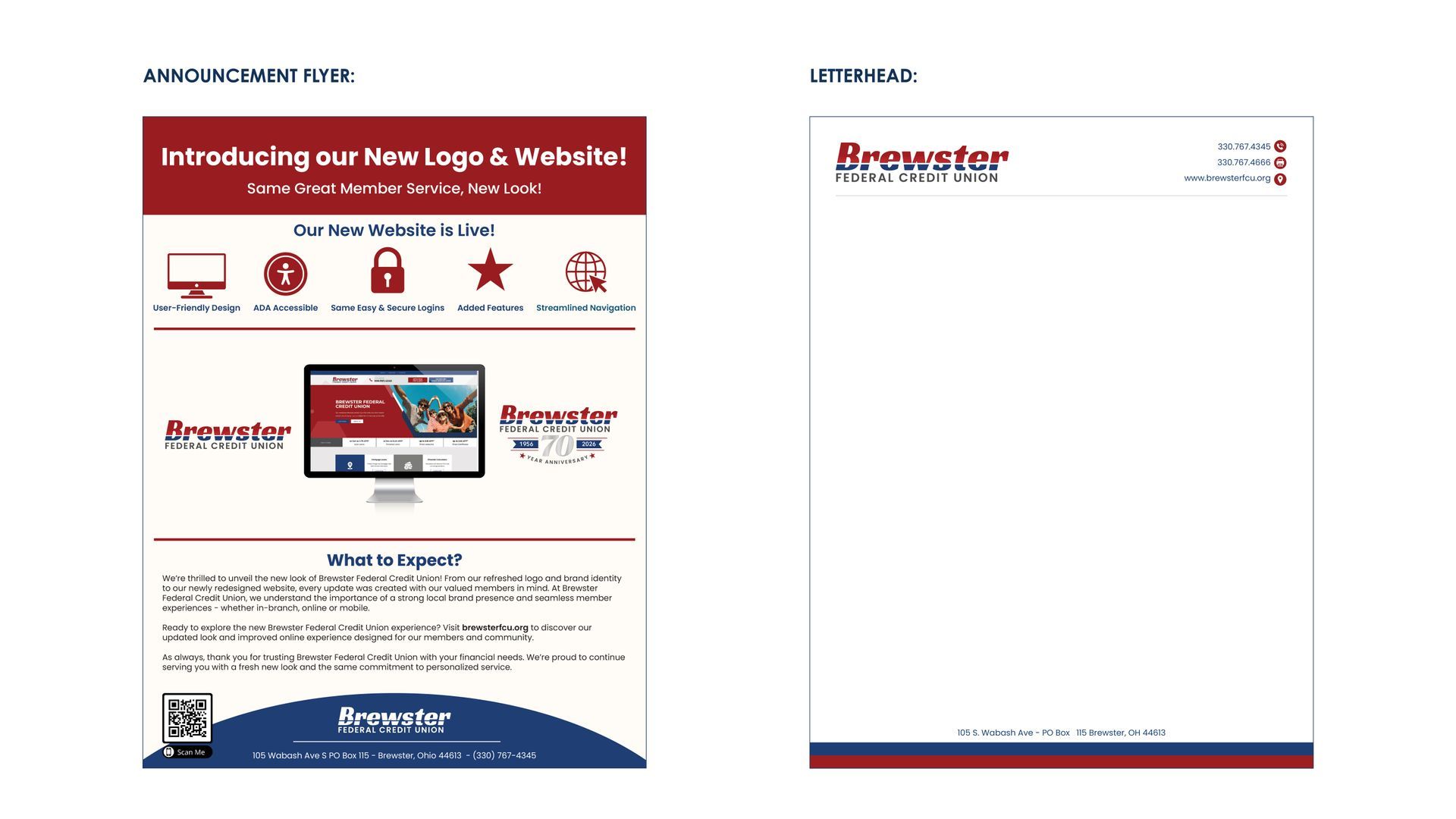
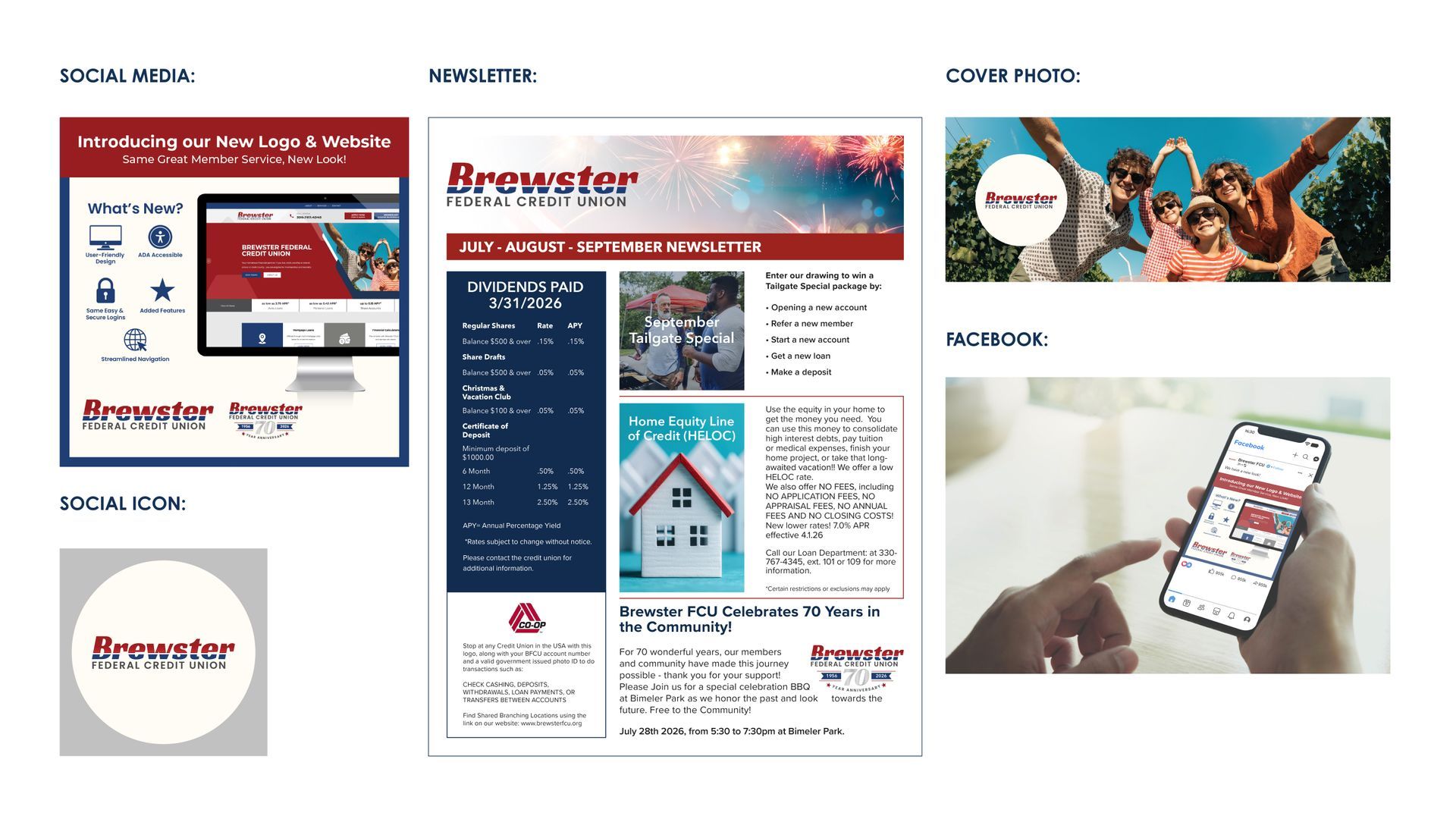
The rollout included a complete suite of branded print collateral - including business cards, letterhead and envelopes. K4 also refreshed the credit union's website with a modern, user-friendly design that improved navigation, accessibility, and the overall member experience. A digital marketing toolkit equipped the Brewster team with branded templates and assets for future campaigns while maintaining visual consistency.
To introduce the new brand, K4 designed a member newsletter and rebrand announcement materials highlighting the refreshed identity and website while reinforcing that, although the look had evolved, Brewster's commitment to personalized member service remained unchanged.